News
-
![]()
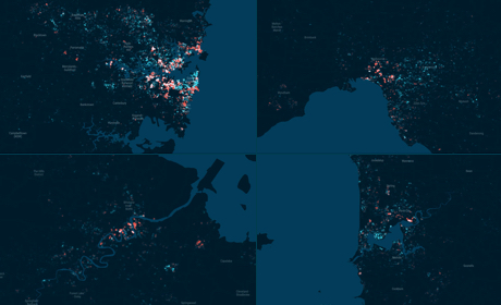
Old Money & Nouveau Riche in Australian Capital Cities
-
![]()
Using dot density maps to visualise complex population data
-
![]()
Where do Sydney's rich and poor live, and who are they?
-
![]()
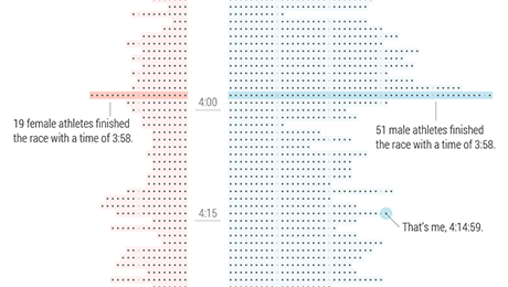
Sydney Marathon Results visualised
-
![]()
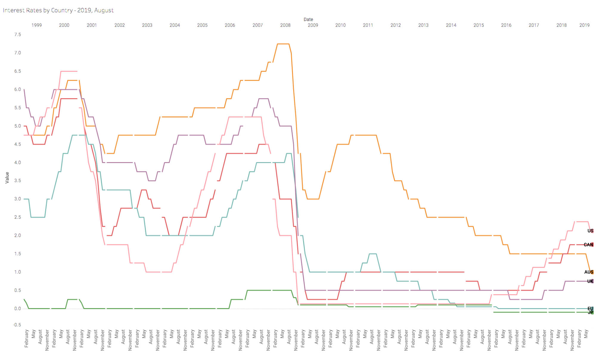
The state of the Australian economy in 3 charts
-
![]()
Wireframing for data-driven applications
-
![]()
Building large maps with a Node.js tile server
-
![]()
Hello, Sun. wins Indigo Design Awards
-
![]()
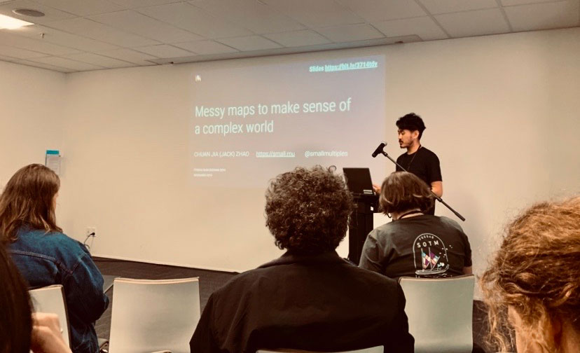
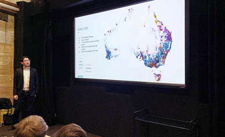
Jack Zhao at Data Visualisation Sydney
-
![]()
Data visualisation conferences in 2019 and 2020
